You know those rooms in the movies where battles are planned and strategies decided? Well, imagine my surprise when, just weeks after my college graduation and fresh into my new job at LinkedIn, I found myself locked in a room full of seasoned user experience designers, developers and product managers mapping out our strategy for the design of LinkedIn’s Connected app for iPhone. For weeks, we spent endless hours looking at research, talking to our members and rethinking the way LinkedIn could help you better manage your relationships -- and I not only had a seat at the table, but held an instrumental role in helping to shape what you see today.
We created wireframes, lots of storyboards and prototyped numerous ideas - most of which never saw the light of day - but this room was where all the ideas started and biggest decisions were made. I’d like to take you behind-the-scenes today to share how the app came together and, particularly, how we embraced a design approach that is completely new for LinkedIn.

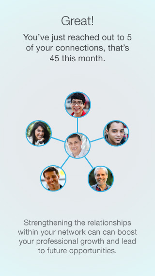
Sitting among cluttered whiteboards and stacks of sticky notes, our discussions kept returning to the topic of “networking challenges” - the anxiety ridden first interaction with someone, or, months later, that all too common “do I wish him or her Happy Birthday even though we haven’t talked in ages?” when you see their Birthday pop up on your feed. Our brainstorms focused on ways in which we could take the work out of these networking moments. This focus became our North Star for what ultimately made it into the final Connected experience and we used three core design elements to help get us there.
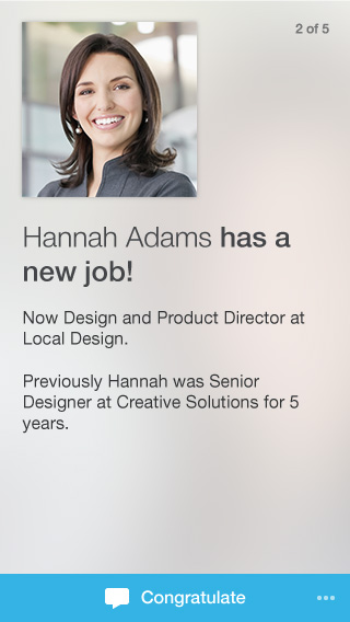
One person at a time: We developed a new card-based interface, a first for LinkedIn, to create an experience that is fun, light touch, and designed to facilitate “connecting.” Instead of bombarding you with content, we wanted Connected to be your go-to place for getting valuable insights about the people in your professional world. The card format we chose really encourages members to slow down, reflect, and reach out.
Delight through motion design: Traditionally, animation or motion design is done as an afterthought, but given my motion design training at school, it was second nature for me to incorporate motion into my approach from the very start. Even in the early stages of the design process, I’d involve the use of animation to communicate ideas to the team.
Connections that count: After many weeks of deliberating, crafting and fine-tuning, the final step was to test the app in a 2-week long study. One particularly impactful learning from our participants was the fact that the app, in its original form, was showing far too many cards in one sitting making the list feel endless and overwhelming. Now, when you open the app, you will notice that you see the top updates for any given day and, once you’ve swiped through them, we present you with a completion marker so you know you’ve accomplished your most valuable networking for the day. You can check an important to-do off your list in the few minutes you have while standing in line, riding the bus, or during your other on-the-go moments.
The next time you’re swiping through your Connected updates, you’ll now know the countless design iterations, prototypes, and detailed decisions that went into the creation of exactly what you’re seeing. If you haven’t yet downloaded the new Connected app for iOS, check it out in the Apple app store.