A new design for LinkedIn
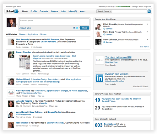
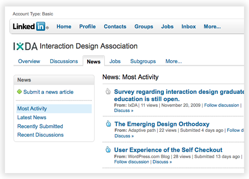
Some of you may have noticed a new site navigation experience on LinkedIn. We are in the process of testing a new design. During this testing phase, some users will see the new design, while others will not.
What’s New
- A global navigation bar at the top of the page that provides convenient access to all LinkedIn services.
- Simplified local navigation within each of the LinkedIn areas (Profile, Contacts, Groups, etc.).
- More room available for page content. Less scrolling.
- A cleaner, less-cluttered look.
An easier way to navigate and find information on LinkedIn
We began the redesign effort several months ago by analyzing how people use LinkedIn. We looked at what features people use the most and pored over several years of data from usability research on the site. Armed with this information we began doing design explorations of how to better organize LinkedIn features, and make them more convenient to find and use.
We factored into this effort additional features we knew were coming. We narrowed down the designs to a few candidates we felt were strong contenders. We then prototyped these designs and had users perform tasks with the prototypes in the usability lab. We went through numerous iterations until we arrived at a design we felt worked the best. One of the key features of the new design is that it allows much more space for page content – information about you and your professional network.
We are now doing limited testing of the new design. We are still iterating and would love to hear your feedback! Please consider this blog post one of the many ways to let us know what you think.
Feel free to either leave a comment for us @linkedin on Twitter as well.


