Simplifying LinkedIn’s Mobile Experience
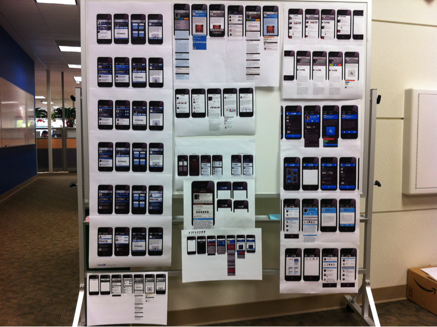
Two months ago we launched a brand new LinkedIn Mobile experience, and the response has been amazing. Given that we totally re-imagined the design of our app, we thought it would be interesting to look back and share some of the thinking that shaped the final product.
A Fresh Start
Though the legacy design provided much utility over it’s lifetime, a close look at usage metrics, our roadmap, and input from users told us we needed to do more to improve the app’s efficiency and ability to support new features such as Groups.
This was a real opportunity to streamline the user experience and elevate high-value content, while laying a stable foundation for future updates. We also wanted to introduce some personality to the app, and create something as beautiful to view, as it was delightful to use.
New Design, Immediate Value
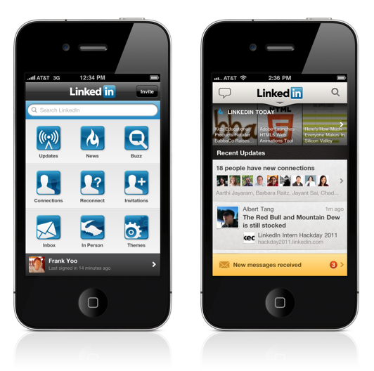
The 3 x 3 icon dashboard can be a great tool for navigating an app; however, that’s where it’s utility ends. In the new app, we present relevant content up-front and instantly notify users of new invitations and messages. In other words, we remove the friction of a dashboard and provide immediate value on app launch.
Keep it simple & get out of the way
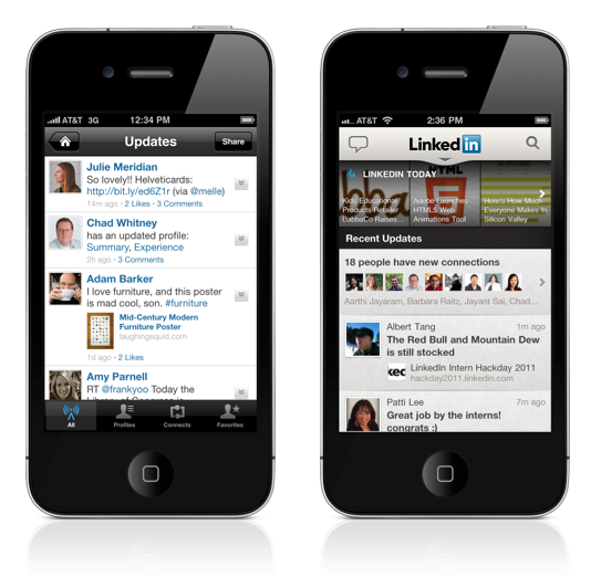
Throughout the app, we eliminated the use of unnecessary tab bars, tool bars, and other interface cruft. The idea being we surface more signal and suppress the clutter. We also wanted to create a holistic design language that could be employed consistently throughout the app. With these goals in mind, we standardized a concise set of design patterns and greatly simplified the user interface (UI) in order to bring critical functionality and useful content to the forefront.
For example, in the old app, tab bars provided marginal functionality that few people actually utilized, and they occupied a significant chunk of screen real estate. It was apparent that people were using tabs to find more relevant content. So, with the introduction of “roll-ups” – where we aggregate new connections and profile updates – quality content and insights rise to the surface. This allowed us to eliminate the tab bar and give users more screen area to consume their stream.
It’s in the details
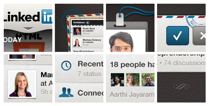
It was important to us that we pay attention to the details. From the color value of the leather grain to the highlights on the typography, we were meticulous about the design minutiae. Visually, we wanted to introduce more richness and create a more striking, high-quality look. In fact, we dedicated 10 days and the collective power of 10 designers to brainstorm and explore visual fit and finish.
During the exercise, we found we could get considerable mileage from the careful and detailed application of few elements such as color, texture, and typography. A lot of time and care went into editing, polishing and debating the sweet spot between tasteful and tacky, and we’re pretty happy with the results.
[caption id="attachment_8006" align="aligncenter" width="540"]
Overall, our team feels great about the redesign, but we know there is much more work to do. We now have a solid, scalable, and attractive foundation upon which we will continue to innovate, so please keep your comments and feedback coming.
We’re just getting started.


